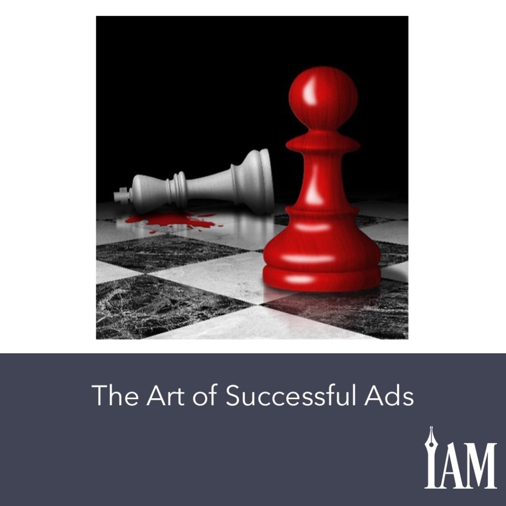
The Art of Successful Ads
Steve Higgs
For some, Facebook advertising can be a hole into which they pour money with little or no return. For others, and I’m one of them, it is the source of a fortune. You have to invest your money to find the things that work. That’s scary, but when you find ads that work, that funny little hobby your spouse rolls their eyes at will make their pension fund look like pocket money.
I have spent close to a million dollars on ads over the past couple of years, always netting a high return from my investment. When you get it right, Facebook Ads act like a machine into which you feed a dollar and get two in return. Or three. Or maybe even five.
However, you can’t just throw money at it. Getting Facebook Ads right is an art many never learn.
There are two elements that rise above the rest in perfecting the Facebook Ad formula:
- audience, and
- image.
In this article, I am going to look at image.
First, let me dispel a myth. I have heard it said and seen it written that one should never use your covers as the images for your ads. This might once have been true, but I often use my covers for ad images. I get text-free versions from my cover artist and zoom in or crop them. This ensures the reader is seeing something very similar to what they will find when they arrive on my Amazon product page.
I might not always use the cover for the book being advertised, but if I don’t, then it’s one from that series instead. Or I’ll use something that is not one of my covers but may look similar.
Recently, I tried to advertise a Fantasy Steampunk Pirate/Tomb Raider series. I tried out a lot of images, including the covers, but the one that got all the clicks was a busty pirate wench. Big surprise, I know.
Still, after everyone clicked the image of the lady in question, no one bought the book. Why? Because the image that drew them in had nothing to do with the series.
The image in the advertisement for any series can be anything so long as it is not too far removed from what you are selling and will catch people’s eyes. Its sole aim is to stop people scrolling.
Then, by using a caption in the image tailored to your audience, you can tell the people seeing your ad exactly what they are looking at and precisely why they need your book in their lives.
The example below is from one of my campaigns.

Figure 1
Can there be any doubt this advertisement is for a Psychological Thriller book?
How about in Figure 2?

Figure 2
I aimed this ad at an audience made up of Psychological Thriller authors and layered it with similar genres to raise my chances of finding the people on Facebook most likely to be interested in it. Without the text from Figure 1, the ad in Figure 2 isn’t clear on what is being advertised. However, by adding a few lines of text and using the word “read” or “book,” the person seeing this ad knows exactly what it is about. By itself, the image sold no books, but adding the caption made it sell dozens of copies a day.
If you read the previous article about audiences, you will remember I talked about a super wide audience where I aim at anyone over thirty years old in America who likes to read or owns a Kindle. Images are the trick to mastering such a scattergun approach. Your image, along with the proper caption, tells anyone seeing your ad that you are advertising a book in a specific genre. In the previous example, the captioned image of the two chess pieces, combined with the first line of text and the headline, removes all ambiguity. People with no interest in reading Psychological Thrillers won’t click it.
But those who are interested might.
My final point is that you can make an educated guess about what images to use, but only by testing out lots of them will you find the ones that work.
Your takeaway this month should be the need to experiment with different images. Your covers might work, but don’t limit yourself to them either. There is just no way to know which image will sell your books until you try a few.
Good luck!

