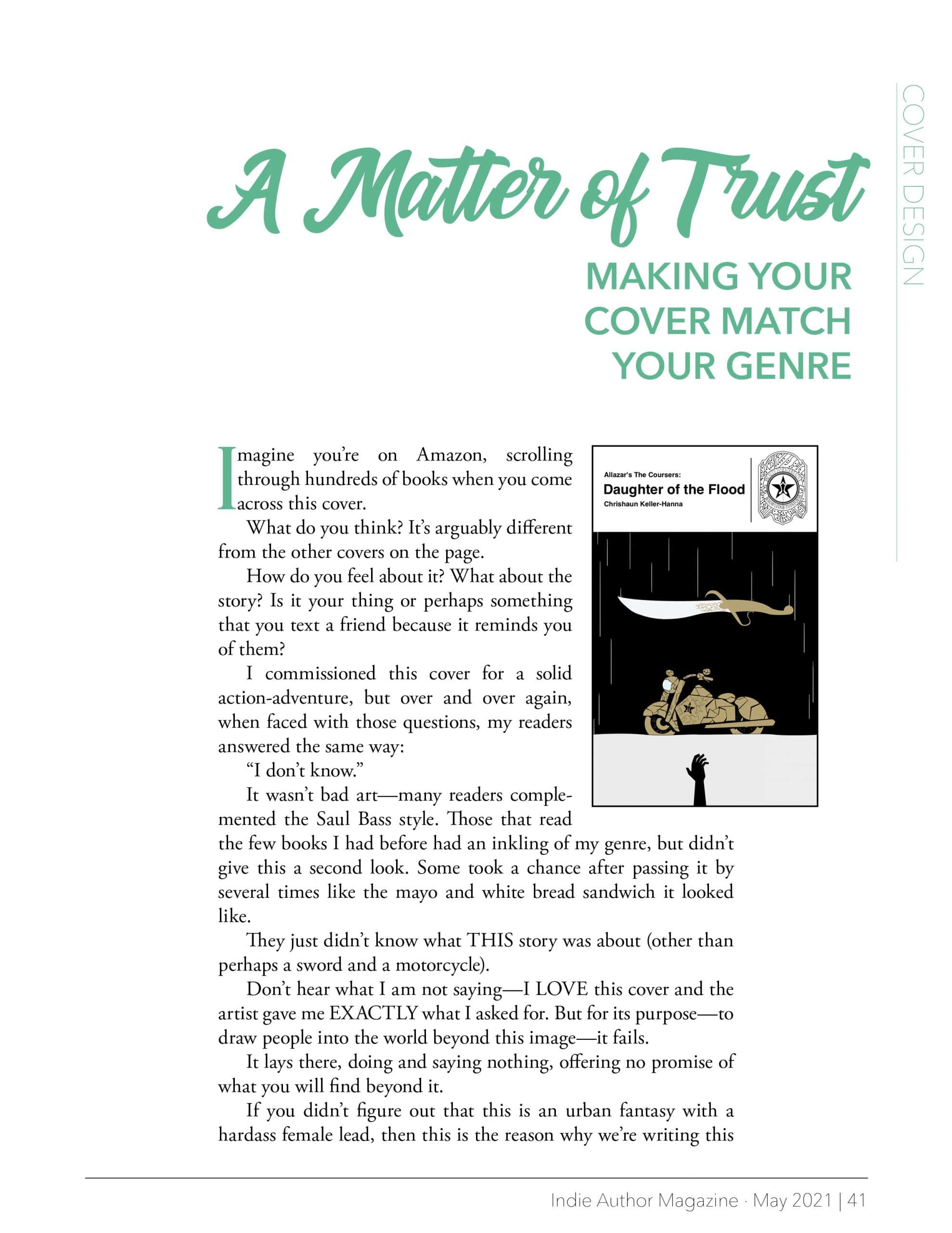
Imagine you’re on Amazon, scrolling through hundreds of books when you come across this cover.
What do you think? It’s arguably different from the other covers on the page.
How do you feel about it? What about the story? Is it your thing or perhaps something that you text a friend because it reminds you of them?
I commissioned this cover for a solid action-adventure, but over and over again, when faced with those questions, my readers answered the same way:
“I don’t know.”
It wasn’t bad art—many readers complemented the Saul Bass style. Those that read the few books I had before had an inkling of my genre, but didn’t give this a second look. Some took a chance after passing it by several times like the mayo and white bread sandwich it looked like.
They just didn’t know what THIS story was about (other than perhaps a sword and a motorcycle).
Don’t hear what I am not saying—I LOVE this cover and the artist gave me EXACTLY what I asked for. But for its purpose—to draw people into the world beyond this image—it fails.
It lays there, doing and saying nothing, offering no promise of what you will find beyond it.
If you didn’t figure out that this is an urban fantasy with a hardass female lead, then this is the reason why we’re writing this article. Thousands of writers see their cover as an expression of their artistic sensibilities or a direct translation of the story within.
And while it can be that, those are secondary considerations.
A book cover is a promise that the story will give the reader the escape, emotion, and excitement that the cover portrays. The goal of the cover above all other things is to instill trust.
A trust that’s developed by filling the cover with elements that proclaim “YES, THIS IS THE BOOK YOU WANT!” or at least “This has everything you want in a story.”
To gain that sort of trust, we have to rethink what we know about genre.
When you hear the word “genre,” you think “sci-fi,” “high fantasy,” “romance,” etc. This makes sense—genre is defined as a category of artistic composition that shares a type of form, style, or subject matter.
Each category has elements that all the stories share to some degree. No matter the author, there’s always a love story in a romance, and there’s magic of some shape or form in high fantasy.
By extension, book covers that tell the same type of story have similar images, composition, colors, and fonts. It creates a world that you can quickly identify with and draws you in.
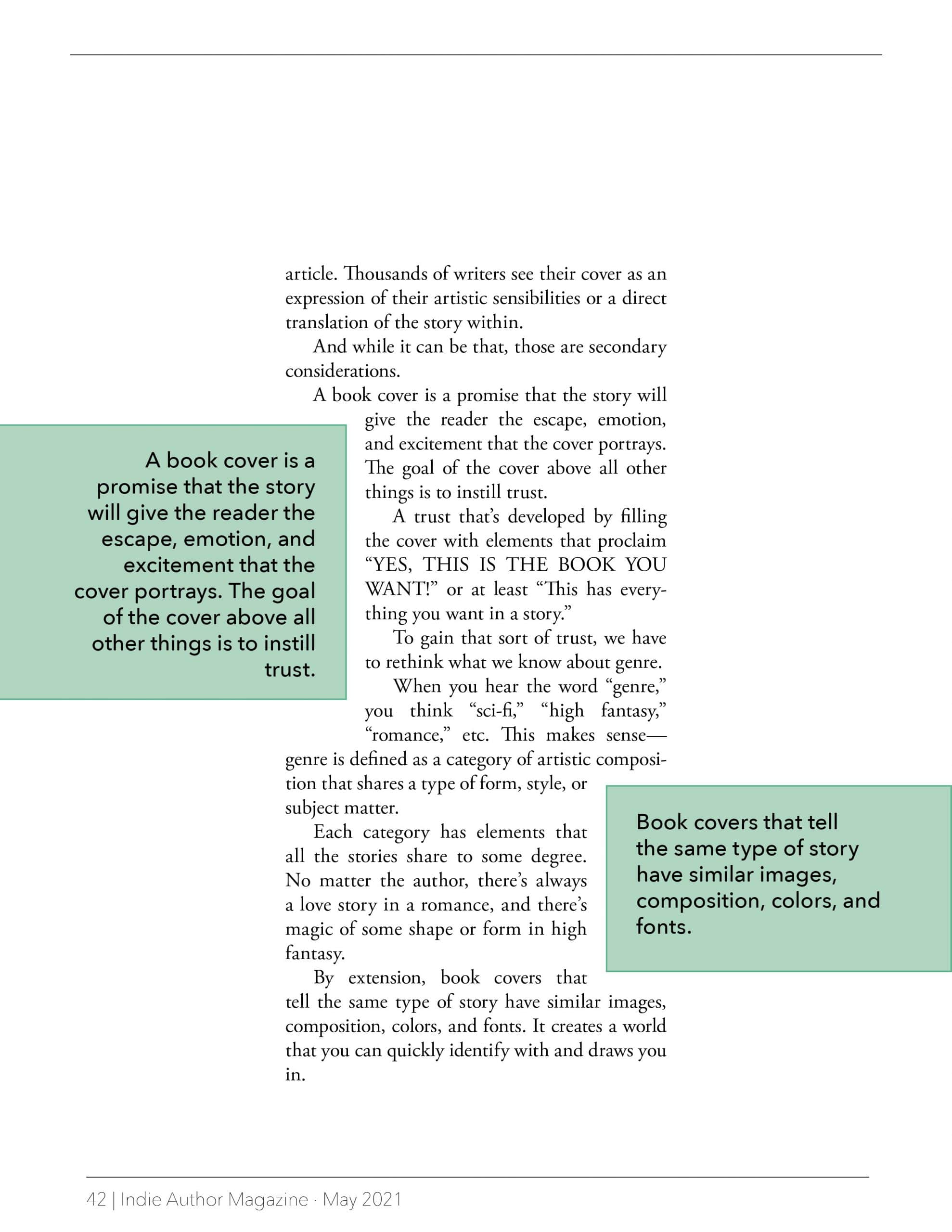
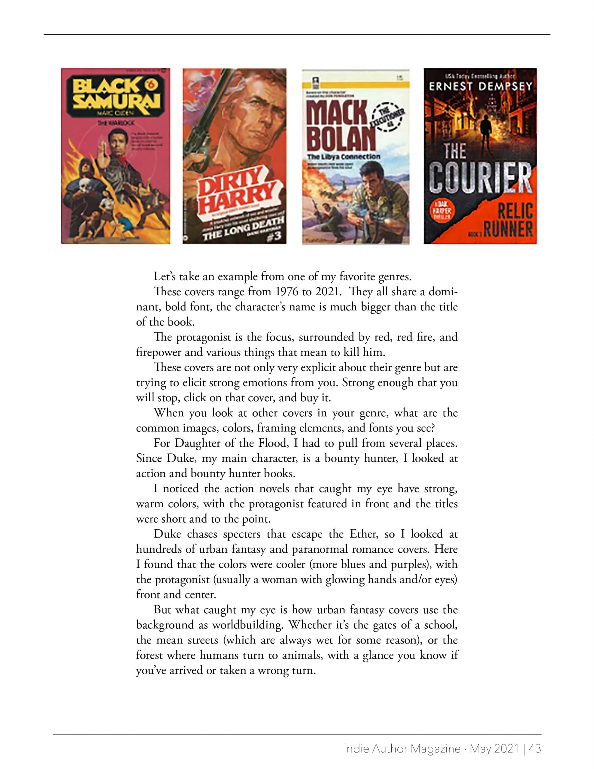
Let’s take an example from one of my favorite genres.
These covers range from 1976 to 2021. They all share a dominant, bold font, the character’s name is much bigger than the title of the book.
The protagonist is the focus, surrounded by red, red fire, and firepower and various things that mean to kill him.
These covers are not only very explicit about their genre but are trying to elicit strong emotions from you. Strong enough that you will stop, click on that cover, and buy it.
When you look at other covers in your genre, what are the common images, colors, framing elements, and fonts you see?
For Daughter of the Flood, I had to pull from several places. Since Duke, my main character, is a bounty hunter, I looked at action and bounty hunter books.
I noticed the action novels that caught my eye have strong, warm colors, with the protagonist featured in front and the titles were short and to the point.
Duke chases specters that escape the Ether, so I looked at hundreds of urban fantasy and paranormal romance covers. Here I found that the colors were cooler (more blues and purples), with the protagonist (usually a woman with glowing hands and/or eyes) front and center.
But what caught my eye is how urban fantasy covers use the background as worldbuilding. Whether it’s the gates of a school, the mean streets (which are always wet for some reason), or the forest where humans turn to animals, with a glance you know if you’ve arrived or taken a wrong turn.
Give some thought to what single feeling you want to rush over the reader. And use every element and trope to reinforce that.
The new author always wants their story to stand out from the thousands of other offerings out there. And of course—the book that is seen is the one that’s clicked on.
But being too original, like the Daughter of the Flood cover above, risks losing an opportunity to stir up emotions and connect. The same elements are used because they’re proven effective in doing just that.
However, there’s some wiggle room, if you just can’t bear the thought of putting yet another girl with glowing hands on a wet back alley on your urban fantasy novel.
Look at covers in your genre from different decades or international editions for fresh ideas that still work.
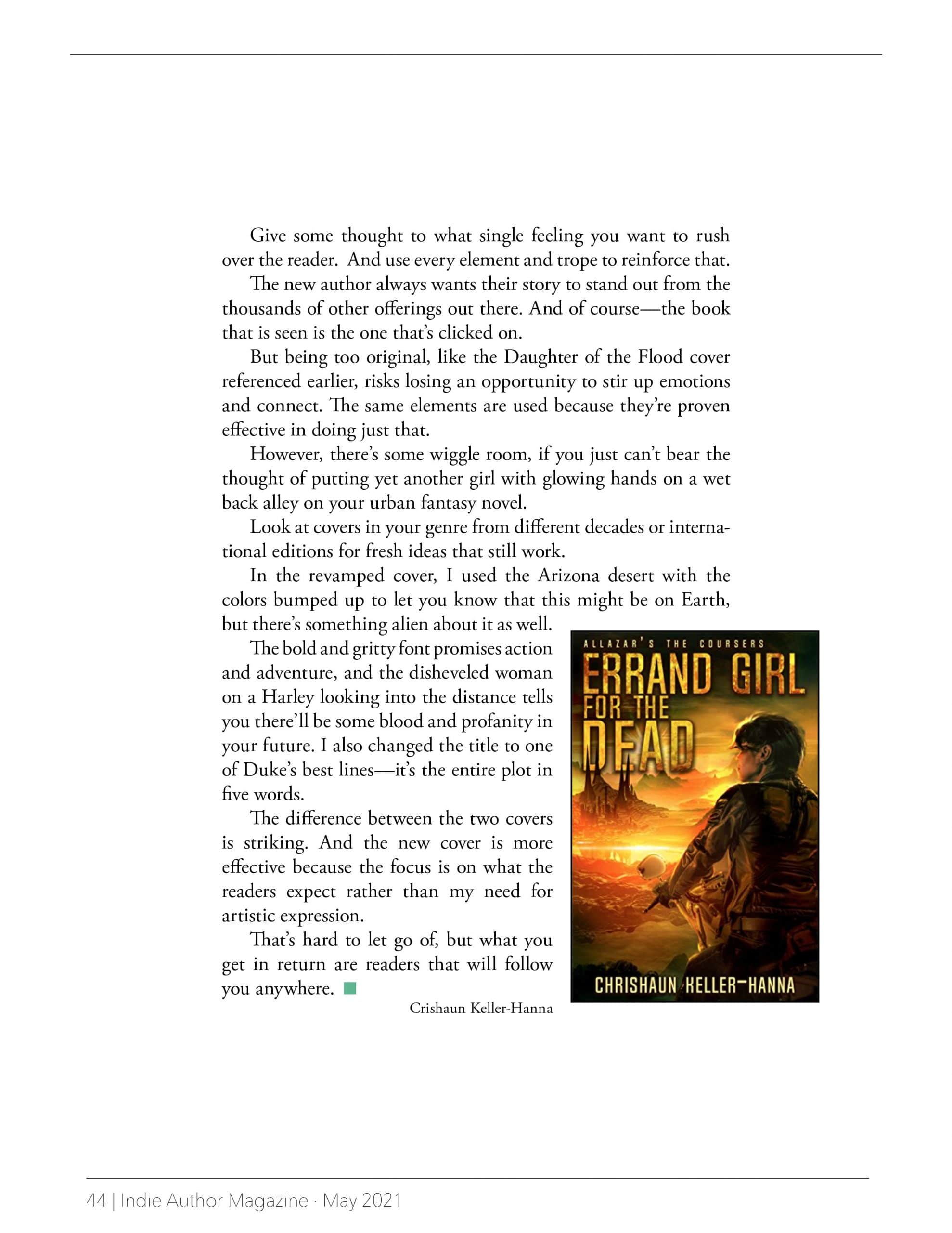
In the revamped cover, I used the Arizona desert with the colors bumped up to let you know that this might be on Earth, but there’s something alien about it as well.
The bold and gritty font promises action and adventure, and the disheveled woman on a Harley looking into the distance tells you there’ll be some blood and profanity in your future. I also changed the title to one of Duke’s best lines—it’s the entire plot in five words.
The difference between the two covers is striking. And the new cover is more effective because the focus is on what the readers expect rather than my need for artistic expression.
That’s hard to let go of, but what you get in return are readers that will follow you anywhere.


