How Color Mapping and Psychology Can Help Your Cover Stand Out
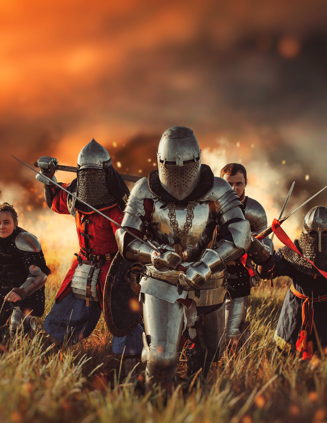
In the May issue, we talked about how authors generate trust by having their covers reflect the story within. We pulled several bold and rather red action adventure covers together to compare and contrast the elements to illustrate how the bold designs, font, and red suggested action and resulted in a more effective cover.
This month we’re going to dive deeper into this technique, called a comparable board.
This excellent tool is the refined digital version of the artist’s morgue, a collection of references and inspirations artists collect to brainstorm their concept, visualize the tone and theme.
Authors take this a step further and use them to confirm that their cover is on track.
Combine this with color mapping (identifying the colors present in the image) and color psychology, and you have a powerful tool in this alchemy of words and ideas that we call cover design.
This applies to non-fiction as well as fiction. There will be examples of both as we walk through brainstorming, visualization, and confirmation steps.
How do you gather all your ideas together?
That great notebook you write bits of dialogue in you don’t want to forget or that idea that’s not quite ready to be a story. Or maybe it’s a scrapbook filled with cutouts of magazines, comics, sketches, stickers, ticket stubs, and programs? Or the tech-inclined among you that just opened your Pinterest account and already have a board of each character, location, and weapon (if applicable). Or simply that portion of the wall with all the post-it notes?
If you said yes or smiled as you thought about your own collection method, then you have already completed the first step:
Have a reliable place to collect and the covers that align with the story you’re telling—and check it often.
During the brainstorming and outlining phase, the more images you collect, the better. Explore, but focus on covers in the same genre that generate the same emotions you want to elicit.
The shape of your story and the details you want to reveal to the reader may change from the outline to the final edit. So as your story becomes more concrete, look through your board and remove images that directly serve the story and use them to create a new board. This way you stay on track without losing future inspiration.
What’s the idea that recurs in your novel? The ideal that’s diffused throughout every part of the story?
It’s okay if you don’t know, sometimes you have to feel through it.
But what if you’re creating a non-fiction or a memoir that’s unique and there’s just isn’t anything quite like your book out there?
In that case, focus on how you want your reader to feel when they see the cover and the message you want them to leave with. That is achieved by setting the mood with color.
Bringing the Tone and Theme to Life
Brands spend a lot of money and research finding the perfect colors to engage their audiences. And that makes sense—color is one of the strongest communicators, reaching us on a subconscious level, evoking anything from joy, to frustration, to isolation and triumph.
With the right combination of images and colors, your readers will create strong emotional reactions and associations with your cover, compelling them to buy.
This is referred to as Color Psychology, and while it can be complex, the process can be condensed into a few simple steps.
- Choose a color that relates to the emotional pull of your story (consult the images and covers you collected).
For example, red is the color of action, danger, and energy. It boosts the heart rate and promises a story that gets the blood pumping. Darken it a bit and it signifies passion, danger, and opulence.
Yellow motivates the brain and encourages critical thought. Many non-fiction books use yellow, orange, or gold for this reason.
Blues calms the brain and invites the reader to relax and ponder.
There are several great books on color psychology, including Newberry Color Theory by Michael Newberry and The Secret Lives of Color by Kassia St Clair. Canva, the online graphic art program, also has a comprehensive guide that provides the history and meanings of hundreds of colors.
- Add no more than two dominant colors that enhance the overall tone without clashing or being too cluttered or noisy.
If that seems a bit daunting, consider a palette creation program like Coolors or Canva’s Color page. Sites like these will create a palette for any image that you upload and even create graphics based on the palette.
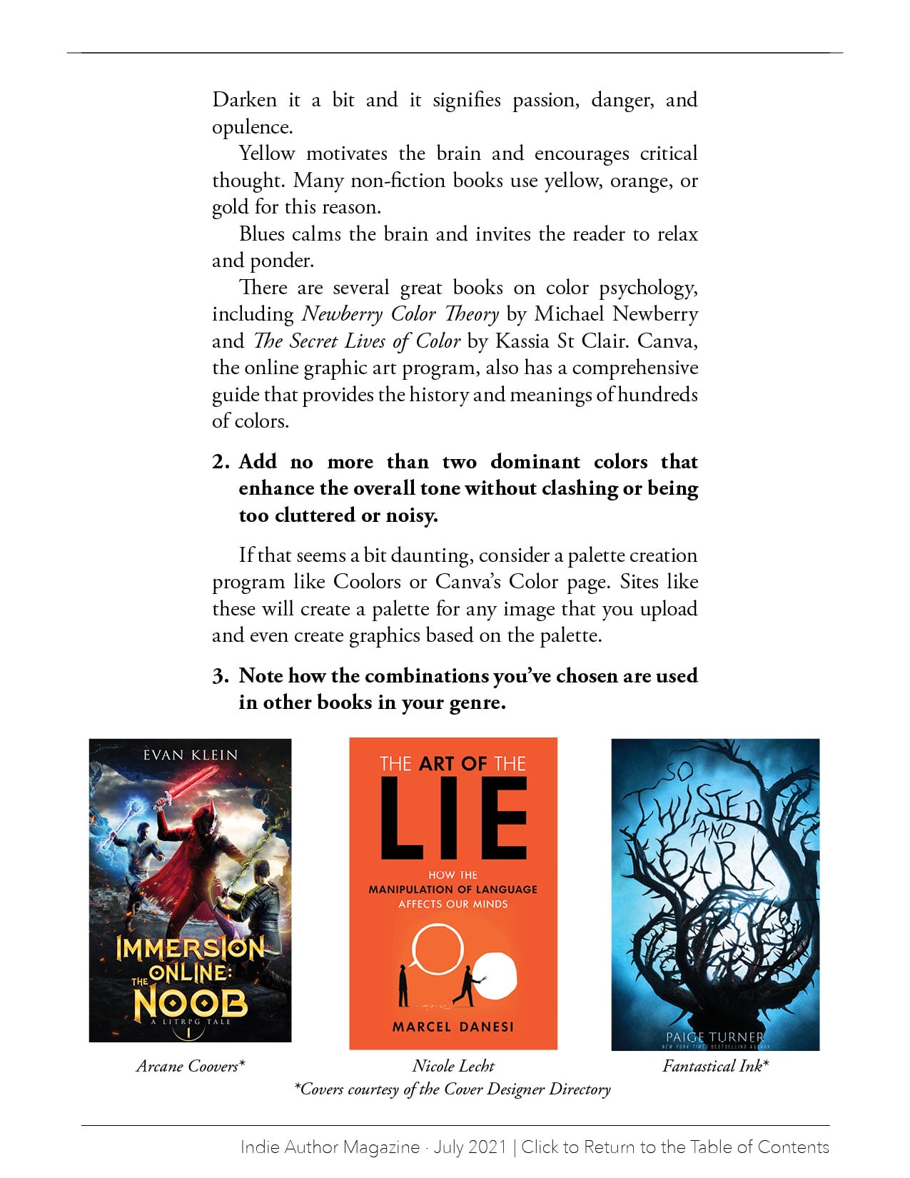
- Note how the combinations you’ve chosen are used in other books in your genre.
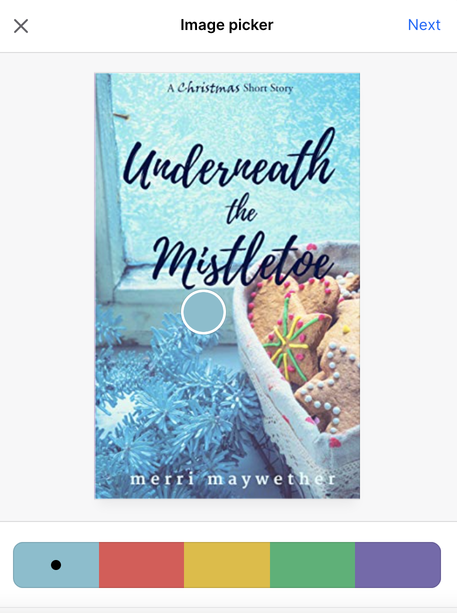
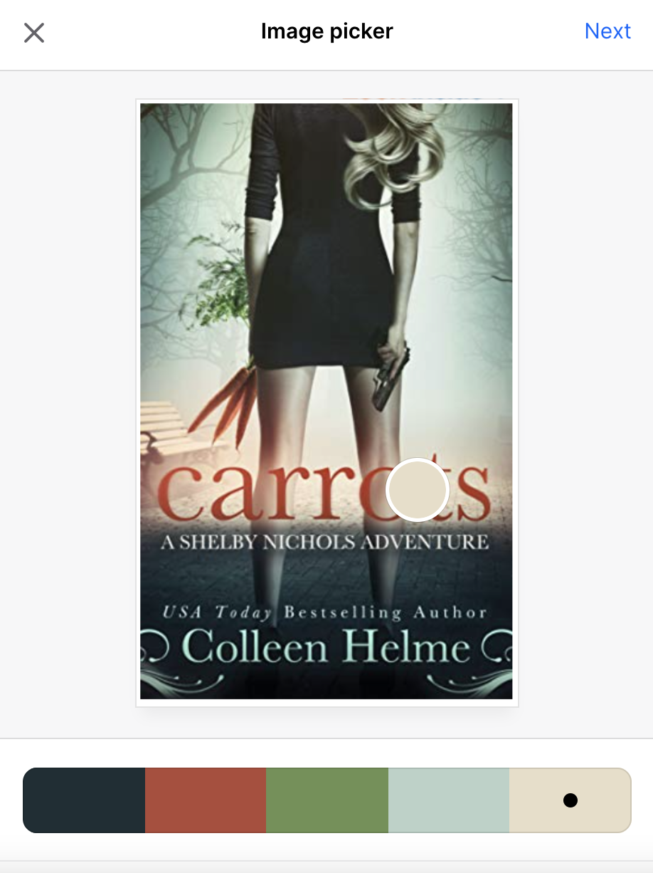
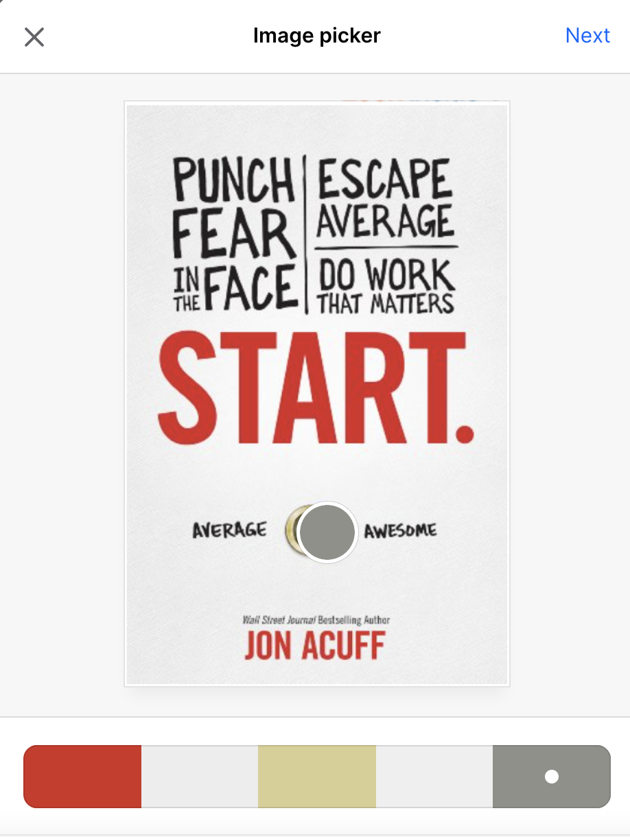
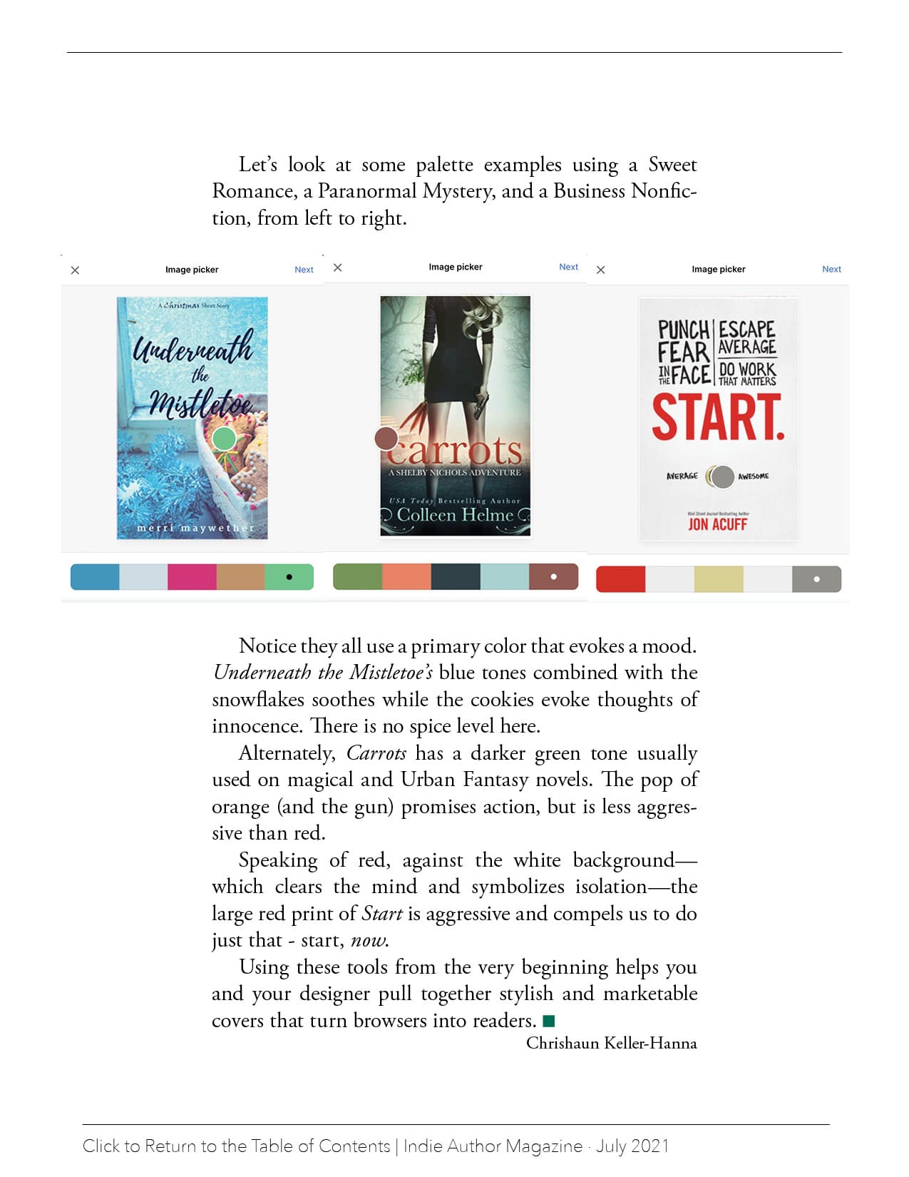
Let’s look at some palette examples using a Sweet Romance, a Paranormal Mystery, and a Business Nonfiction, from left to right.
Notice they all use a primary color that evokes a mood. Underneath the Mistletoe’s blue tones combined with the snowflakes soothes while the cookies evoke thoughts of innocence. There is no spice level here.
Alternately, Carrots has a darker green tone usually used on magical and Urban Fantasy novels. The pop of orange (and the gun) promises action, but is less aggressive than red.
Speaking of red, against the white background—which clears the mind and symbolizes isolation—the large red print of Start is aggressive and compels us to do just that – start, now.
Using these tools from the very beginning helps you and your designer pull together stylish and marketable covers that turn browsers into readers.